
Designed for creative professionals and artists, Easel is a cloud storage app that stores all your creative projects.
Collect, create new content, and share favorite projects and ideas directly to friends, colleagues, and social media.

Research
Content Strategy
Design
Brand & Identity
User Surveys
Competitive Analysis
Personas
User Stories
User Flows
Content Strategy
Sketches
Wireframes
User Tests
Style Guide
Hi-Fi Prototype
Figma
InVision
Whimsical
Usability Hub
Maze
There are many unrealized possibilities in the cloud storage and organization market. Even with multiple big-name competitors, the emerging market is still young, and there's room for another player.
My client saw an opportunity to enter into the cloud storage market and hired our agency to create a product that would be able to compete within this highly competitive market space.
Tailored to creatives, Easel provides users a more efficient way to connect through their work. The tools creative professionals need are available all in one app.
Easel gives artists and creative professionals, better collaboration, and organization. With user-generated tags, grouping starred items, mood boards, and creating folders, Easel makes it easy for users to keep their content highly organized.
By direct messaging, and sharing content directly to social media, users can ease their creative workflow and share content with others and the world.
To start this project, I began with a user survey to better understand the needs of creative professionals.
I asked detailed questions about their current cloud storage. Questions about what tools they use, features they love, and what they think is missing gave me a clearer vision of what was needed to create our app. I also asked what they liked and did not like about their current cloud storage service.
Forty-three people participated and answered 20 questions, and 73.1% are actively creative or work as a creative professional.
.svg)
Roughly 68% of participants use cloud storage daily, followed by 14.6% monthly, and 12.2% weekly. 4.9% of participants rarely use cloud storage.

90.2% of participants use Google Drive.
61% use Dropbox, and 68% use iCloud.
Participants often use more than one cloud storage service.

95.1% use cloud storage to access content from multiple devices.
80.5% use cloud storage to share content with others.
61% of participants use cloud storage to collaborate on content with others and to have access to tools to create content.

58.5% of participants felt their current cloud storage service lacked features for organizing or needed improvement.
51.2% of participants also lacked access to better creative options for layouts to display, organize, and share their work.
The most significant pain points for participants are a lack of custom organizational tools, complicated or non-intuitive features for sharing work, and lack of tools to create content.
The most frequently used features are backing up and storing work, accessibility from multiple devices, saving ideas and inspiration, and sharing content with others.
Features most desired are the ability to share content with people or groups, access to tools to create content, and sharing directly to social media accounts.
Google Drive is a definite competitor. 90.2 % of participants are currently using Google Drive as a cloud storage service.
I also decided to study Pinterest and Paste by We Transfer. Both Pinterest and We Paste store and share the user's creative inspiration, which appeals to Easel's target audience.
By performing a SWOT analysis for each competitor, I was able to gain insight to determine the direction for Easel. In addition, studying the competition allowed me to envision how to position Easel uniquely in the cloud storage market.
+ Google Drive integrates with the rest of Google and achieves the "network effect" by user collaboration and adoption of Google apps.
- Google Drive lacks organization options, creative content creation, and custom tagging.

+ Pinterest is successful at sharing images curated via inspiring boards. Users can customize their feed and search for inspiration. Users can also share mood boards with others or create private mood boards.
- Pinterest lacks content creation tools except for boards and has limited options for organizing information. It also has been slow to evolve and add new features to keep users engaged. 80% of its users identify as female, which indicates a large portion of their potential audience has not been considered.

+ Paste by We Transfer integrates with many apps and is accessible on both mobile and desktop. It is easy to organize content via decks, create groups for collaboration, and invite members for a custom team.
- Paste has limited options to connect with teammates for better workflow. No storage for files is available other than content built into decks.
All three of the competitors lacked customized organization options, had limited content creation tools, and no ability to post directly to social media.
With this information, I sought to create a tagging and starring system for better organization. Other features include options for mood boards for content creation. Users will have the ability to share content with others directly and the world through posting straight to social media.
Combining all my survey data, I crafted two user personas to bring my target audience to life. These two personas capture the needs of the creative professionals for whom I designed this app.

“It would be cool to merge everything I like and ditch the stuff I hate about Pinterest and Google Drive. I would love to have an app where I could streamline creative collaboration and share my work with others, all while keeping it organized in the cloud for my sanity!”
Violet uses many cloud storage apps for multiple different purposes. She uses Adobe Creative Cloud and the associated apps for content creation at her day job. For keeping track of articles she wants to read, she uses Pocket. Anylist is used to store favorite recipes and grocery lists. Pinterest for creating image mood boards filled with ideas and inspiration. She uses Instagram to show her art and Google Drive for documents and other files. She showcases her graphic design work on Behance as well as her website.
Violet has difficulty showcasing her creative work due to storing it across a few different cloud storage apps. She hasn’t found a good option designed specifically for creatives sharing and saving their work. Not very many layout options or ways to creatively organize content. Lack of collaborative features for commenting and approving content shared.

“I would like an app where I could store all my fine art images and have a tool to create a mood board of my art for sharing with potential galleries. It would be cool if those files were easily organizable so I could keep them separated from my freelance work. For freelance work, having a feature where I could receive comments and approval on shared projects would help me work faster.”
Jason is a working artist and does commercial freelance illustration work as well as fine art. He shows his work across the country in galleries and has to keep track of art currently being displayed or held in gallery inventories for sale. Managing his files for freelance projects is another need as well. He uses Google Drive for personal art business and also for freelance. Instagram used to showcase all of his work together. People who hire him freelance often find him through Instagram.
His current cloud storage lacks organization options for creatives, such as tagging, and starring items, which would help him keep his freelance work and fine art better organized. There is also a lack of creative layout options for displaying work. He would like an app with tools to create content for clients and to email to galleries, as well as a feature to share his work on Instagram.
The information gathered from market research and competitive analysis allowed me to determine the most important main features for differentiating our product from the competition.
By prioritizing the main features of the product, I created user stories for creating folders, tags, mood boards, and starring items. Additionally, I created stories for the onboarding process, and file uploading.
Next, I converted high priority, and some medium priority user story tasks into user flows using Whimsical. These user flows visually illustrate how the user moves through the app and accomplishes the primary functions from the user stories.

All Users: “Want to create account, log in, and reset forgotten password.”| High
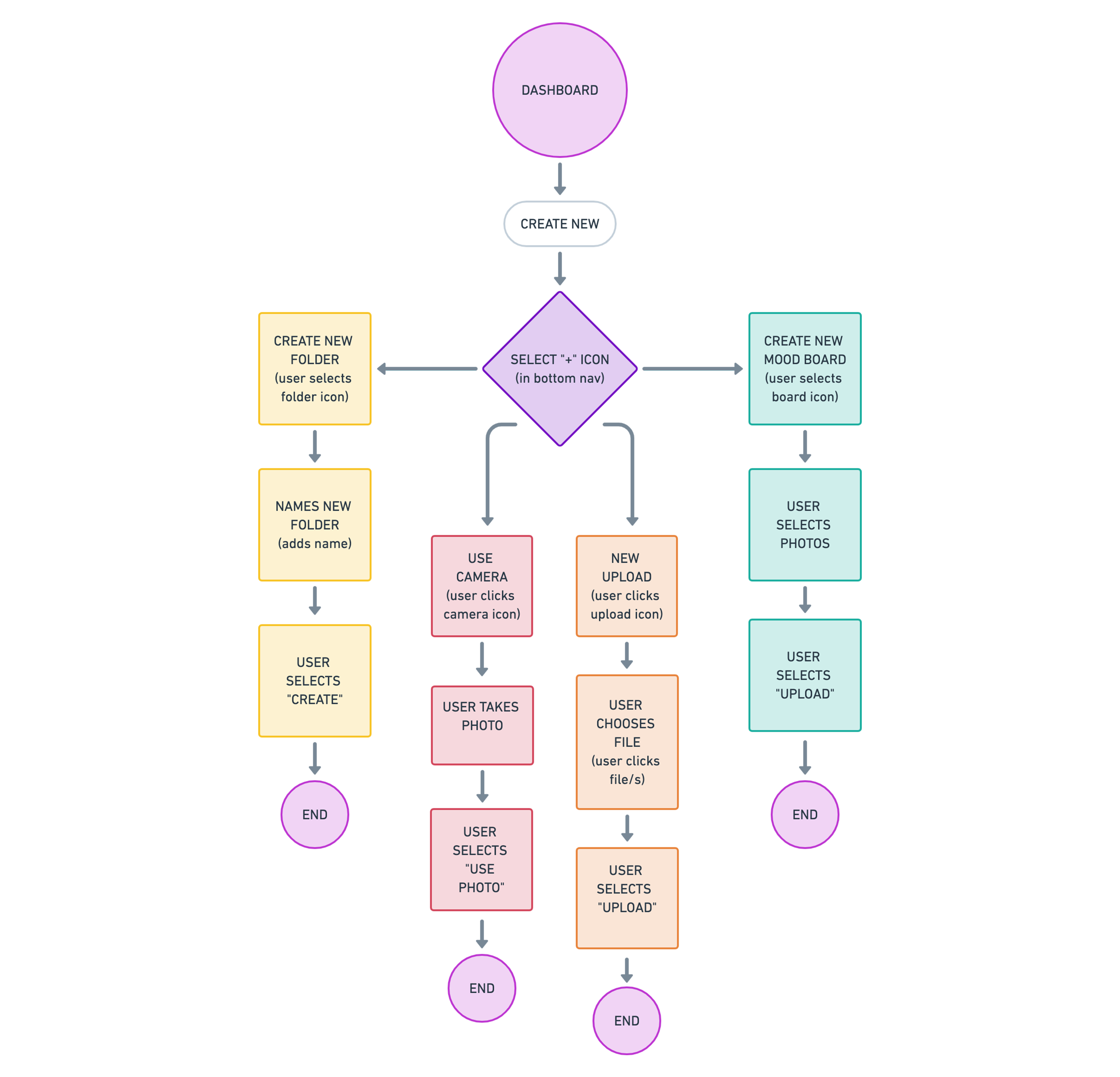
All Users: “Want to create folders, mood boards and to upload content. ”| High

All Users: “Want to move and organize files using tags, mood boards and folders.”| High

All Users: “Want to share my content with others” | High

All Users: “Want to send messages and chat directly to users in realtime”| High
Based on the user stories and user flows I created during the research phase, I drew rough sketches to visualize how the screens would look. I did a few different sketched iterations, which helped inform the best possible design layout.
Taking the best sketches, I created low-fidelity wireframes for all my user flows. Next, I linked them together to create a prototype in Figma to test potential users. The results of those user tests informed multiple iterations of flow design.
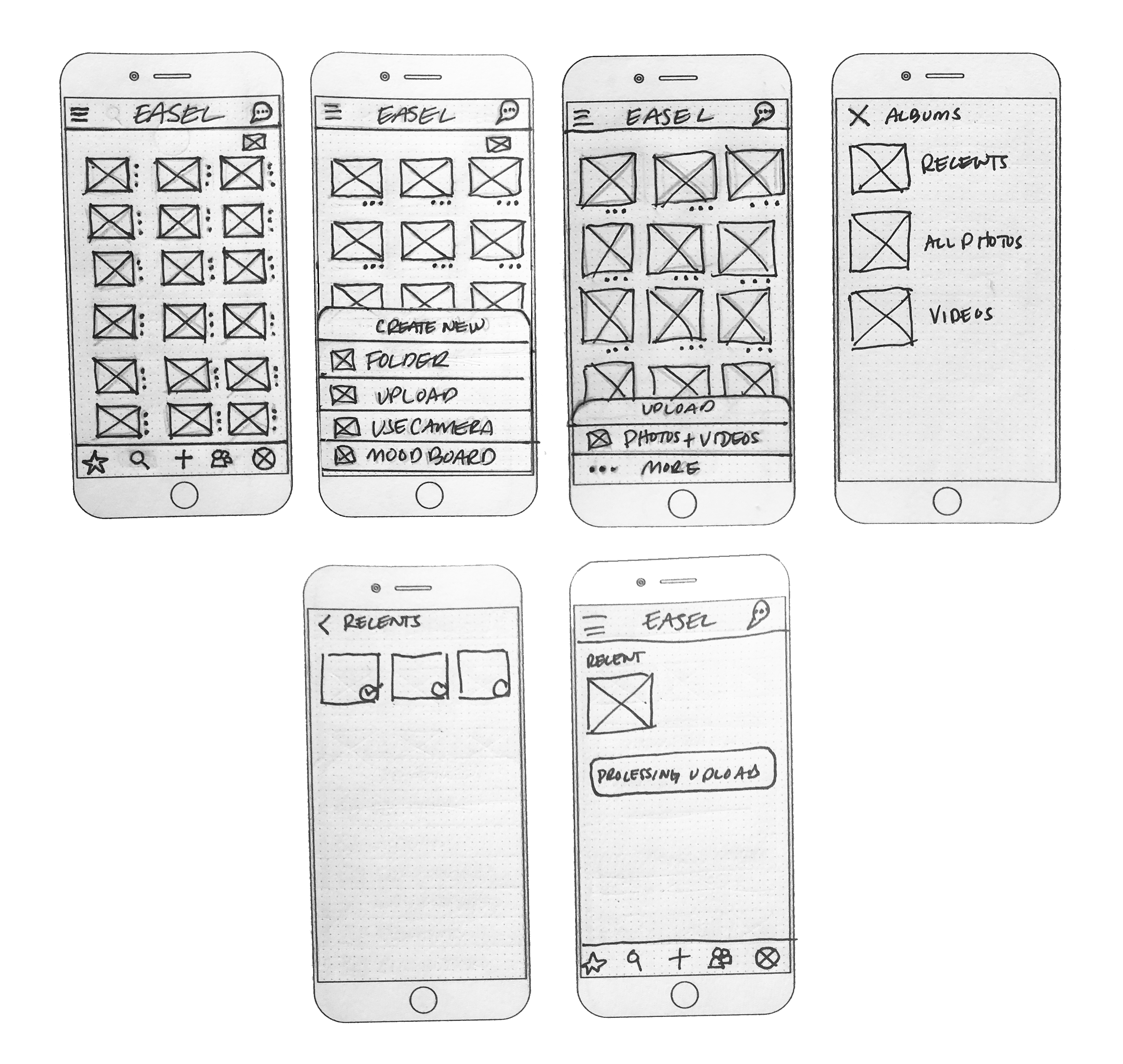
Easel wireframe sketches: Uploading content.

Lo-fi wireframes: Upload Content

Lo-fi wireframes: Onboarding/Create account.
Testing the usability of our prototype helped identify any flaws that our app might have had in early stages, before putting all effort into design and development. I received substantial information by conducting both in-person and remote testing, all of which I recorded and took detailed notes.
Tasks the participants were asked to complete:
- Signing up for an account
- Adding a piece of content
- Organizing a piece of content
- Share an item
- Log out
- Reset password
Findings from the usability tests revealed some hesitation when choosing to share an item due to some confusion with the bottom navigation bar icons. Additional feedback included moving the profile from the bottom navigation to the top right of the app and clearing up the uncertainty surrounding the two-person icon in the navigation bar. The search bar made more sense to add to the top, and in it's place add a files icon for direct access to all files.
Overall, the users were able to accomplish everything asked of them smoothly. With a couple of tweaks going forward, I feel confident in the improved usability of the app.
Changes to be made to the home screen after usability testing:
- Swapping the chat and profile icons, or adding the profile to options in the hamburger menu.
- Moving the search bar to the top of the app.
- Replacing the search icon in the bottom navigation bar to a 'files' icon for quick access to all files.
- Make the two-person icon in the bottom navigation bar more clear, more obvious to the user as shared content.
- Ditch the extra features in user profile. They exceed the scope of project and do not meet MVP requirements. They are great additions for product updates in the future, however.
- Lastly, remove the Easel logo at the top because the branding in-app is unnecessary and takes up valuable space.

Considering our target audience, I sought a brand name that would appeal to creatives and also represent the identity of our product. Easel was the first name that came to mind and ultimately the best suited. Easels are supportive tools creatives use to work on their art projects. I felt the name Easel expressed the primary purpose of our product as a tool. Easel also contains the word "ease," which was helpful to convey the product's ease of use.
After sketching and multiple logo iterations, I finalized a modern geometric "E" for the logo icon using Adobe Illustrator.
The logo is named the "Tulip" because of its tulip flower shape when looked at sideways. The Dutch historically prized tulips. During the Dutch Golden Age in 17th-century, the Dutch's obsession with tulips resulted in what is known as "tulip mania." Also, during the Golden Age was the Golden Age of Painting. The Netherlands was home to more incredibly prolific painters per capita than any other time in history.

Easel's branding colors aim to invoke creative energy and spark the imagination. The color palette is warm, inviting, and on-trend.
Geared toward creatives, the app's style, and colors needed to reflect that. Creating a mood board gave me focus and direction to develop the brand style.
The Easel core color palette consists of seven colors: Salmon, Urobilin, Timberwolf, Night Rider, Hush Gray, Sunglo, and Plain White.

To make the product stand out, I put my illustration skills to use and created custom illustrations to unify the brand vision and identity.
I refined the visual message by illustrating hands, which envoke the creative process. The hands and shapes provide the user with a fun and memorable user experience unique to the brand.

SF Pro Text is Easel’s primary type family and is used whenever possible in the display copy. It is available in multiple weights: Ultra Light, Thin, Light, Regular, Medium, SemiBold, Bold, Heavy, and Black. It is also available in Italics.

Pensum Display is Easel’s secondary type family. It is also the Logotype used in the weight “Black.” Use this type sparingly to communicate key brand messages, headlines, advertising, and display copy. It is available in multiple weights: Extra Light, Light, Thin, Book, Regular, Medium, Bold, Extra Bold, and Black.

Overall, the participants found the lo-fidelity prototype easy and intuitive to use while completing the tasks required. However, the testing revealed some hesitation when choosing to share an item due to uncertainty with the bottom navigation bar icons. Circling back to the feedback from our usability testing gave me insight and informed the changes I needed to make while designing the hi-fidelity wireframes. Additional feedback included moving the profile from the bottom navigation and clearing up the confusion surrounding the two-person icon in the navigation bar.
I changed the two-person icon in the bottom navigation bar to a more prominent "group" icon that better conveys the location of previously shared content. I moved the profile icon to the hamburger menu and the chat icon to the bottom navigation. For better usability, removing the search icon from the bottom navigation made sense. Now the search bar is located at the top of the dashboard. Next, I needed to rethink the bottom navigation bar after removing the search icon. I added a folder icon to have direct access to all files, which felt like an essential feature in the bottom navigation.

I tested iterations of several design elements using A/B testing via Usability Hub. I wanted to see if the illustration of the hands I created for the desktop and mobile landing pages conveyed a creative spirit. So I decided to test two different illustrations. I also ran tests for two different logo versions, and tests to determine the best background for the dashboard to see what users favored most. Images bordered in blue were the most favored.
Which illustration do you prefer? 75% of participants chose the landing page illustration on the right, with the hands and gave feedback stating it felt like it embodied the creative process.


Which logo do you prefer? 69% of participants chose the alternate color logo as their favorite; however, multiple users said they liked both color and black. Many suggested using both logos since one is just solid black, and having a color alternate would be suitable for branding and marketing.


Which background do you prefer? 90% of participants chose the white background, but some users did like some of the separations that the darker colored background provided.


Armed with feedback from our preference tests, I finalized the landing pages for both desktop and mobile.

With the new data from our preference tests, I developed the second iteration of the high fidelity prototype and did another round of user testing. Based on the user feedback, I realized that I needed to make some of the icons and buttons stand out more by using brighter color.
I also decided to add a dark mode feature to reduce eye strain since the primary background color is white. Offering a dark mode option for users is a fun, and helpful feature that I felt would appeal to our target audience.

